Graffiti Letters Alphabet: Three Styles to Draw on Paper
Graffiti letters are capital letters drawn as shapes, slanted, overlapping, outlined, and often set on a dark shadow so they look painted. On paper, the same alphabet comes in three styles that build on each other, a quick one-line tag, a fat bubble throw-up and a square block letter with a 3D shadow. This guide draws each style with a pencil and a marker, then joins the letters into a word and a name.
What graffiti letters are
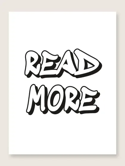
A graffiti letter is a capital you draw the way you would draw a shape. What the eye sees is the outline around it and the lean of the whole word, then the way one letter tucks behind the next and the shadow that lifts the word off the page. The three styles in this guide differ mainly in how fat the outline gets and how square the corners are.
The style grew up outdoors. PBS NewsHour names Cornbread, a high school student from Philadelphia, as the writer most often called the first modern graffiti writer. Galleries only began to show graffiti as art in the 1980s, it says.
The Museum of the City of New York traces the art from New York streets in the early 1970s to museums. Many of those artists, it notes, moved from tagging subway cars to painting on canvas. Everything in this guide stays on paper.
A graffiti letters alphabet in three levels
Learn the three styles in order, because each one reuses the last. A tag is one quick line per letter and teaches the lean. A throw-up wraps that line in a fat bubble outline and teaches overlap. A block letter squares the outline off and adds the 3D shadow.
The kit is a pencil, an eraser, a fine black marker and a thicker chisel marker, plus plain paper. Rule two light pencil lines about an inch and a half apart for every exercise, so the letters in a word share one height. Draw the full alphabet once in each style, A to Z, before you draw a word in it. Plan on about 20 minutes for the 26 tag letters and closer to an hour for the blocks.
A 7-year-old can manage tags. A throw-up suits children from about 9, and the shadow needs the steadier hand of a 10- to 12-year-old.
Simple tag letters
A tag is your name written in one pass, every letter leaning the same way, with the stroke ends pulled out into flicks, arrows or drops. Hold the marker as you would for handwriting and lean every stem about 15 degrees to the right. Speed matters more than shape here. A tag drawn slowly looks stiff.
Three habits make a tag read as a tag. Stretch one stroke in each letter farther than usual, the crossbar of a T, the tail of a Y, the leg of an R. End two or three strokes with an arrowhead or a small drop. Let letters share a stroke where they meet, so the right leg of an A becomes the left stem of the next letter. If you already write in cursive, those joins will feel familiar, since a tag is closer to joined handwriting than to drawing.
Write the same name ten times down a page, a little faster each time. By the seventh or eighth, the hand has settled on one way to make each letter, and that is the tag you keep. For the letter Y, drop the tail well below the baseline and finish it with the arrow.
Bubble throw-ups
A throw-up is a word in fat bubble letters, drawn fast, with one fill color and a thick outline. Write the word in pencil as a tag, an inch and a half tall. Then draw a rounded outline about a quarter of an inch outside every stroke and round every corner. Where two letters sit close, let the outline of the first run under the second, so the letters overlap instead of touching.
The outline step is the same one used to draw bubble letters. That article covers the letters that give trouble, the S, the R and anything with a hole. In a throw-up the letters lean, they overlap by about a third of their width, and the whole word uses two colors only, a fill and the outline. Keep the hole in an A, B or O at least one stroke wide, or close it on purpose.
For the Y, draw the pencil skeleton as a V on a stem and fatten the fork so the notch between the arms stays open. If the notch closes, the Y reads as a lumpy T. Ink the outline in one pass with the chisel marker and fill with a single color.
Block letters with a 3D shadow
A block letter is a capital with a square outline of even thickness and a shadow running off one side, so the letter looks cut from a thick board. It is the slowest of the three and looks most like paint on a wall. Build one letter at a time, with a ruler for the shadow lines until the angle is in your hand.
- Rule a baseline and a cap line an inch and a half apart. Draw the capital as a thin pencil skeleton, leaning about 10 degrees.
- Draw the outline a quarter of an inch outside the skeleton on every side, with square corners. Mark the gap at four points before you join them.
- Erase the skeleton and check the stroke width. Every stroke should be the same thickness, about half an inch at this size.
- Pick where the shadow falls, lower right for most people, and keep it for the whole word.
- From every corner, draw a short line at 45 degrees toward the lower right, all the same length, about a quarter of an inch.
- Join the ends of those short lines with lines parallel to the letter's edges, then erase any shadow line that falls inside the letter itself.
- Ink the outline with the fine marker and fill the shadow solid black with the chisel marker. Let it dry for a minute before erasing.
The Y gives two problems here. The fork makes an inside corner at the top of the stem, and that corner gets its own shadow line. The two arms also end in slanted edges, so draw their shadow lines from the lowest corner of each arm. A 10-year-old who can draw a shadowed E, with its 12 corners, can draw a shadowed Y.
Putting a word together
A word works when every letter shares the same lean, stroke width, shadow direction and overlap. Choose the word before the style. Short words of 3 to 6 letters fit across a sheet at an inch and a half tall. A name is the usual first choice.
Which name? Your own first name, a nickname, a pet's name or a word like READ all work. Names with a Y, G, J or Q give you a tail to hang below the baseline. Names with M, W and B give fat shapes that fill the line. A name made of I, L and T, like LILI, comes out thin in block letters. Widen those strokes to three quarters of an inch and give the I a cap and a foot.
Lay the word out in pencil first as a tag, then move the letters until the gaps match. Overlapping letters need an order. Decide that each letter sits in front of the one to its right, or behind it, and erase the hidden lines of the back letter at every crossing. Then outline, shadow and ink in that order for the whole word, never one letter at a time, or the fatness drifts.
If you want a word to color instead of one to draw, the Graffiti letter generator prints a name of up to 30 characters in slanted outlined letters, shadow on or off. It comes out as a coloring page or as four bookmarks. It is the wrong choice for learning to draw the letters. Trace a printed word twice at most, then draw the third one freehand.
For a child under 7 who wants big rounded letters to color, the bubble letter alphabet has one letter per page, about 7 inches across, an easier start than the three styles here.
Drawing a full name in one style
Take the name RILEY in block letters with a shadow, since it holds a narrow letter, a round one and a Y. Rule the two lines an inch and a half apart across a sheet turned sideways. Write R, I, L, E, Y as a pencil tag, each letter about an inch wide and leaning 10 degrees, with a quarter inch of overlap between neighbors. The I and the L will look lost. Give the I a cap and a foot and stretch the L's foot under the E.
Decide the stacking, say each letter in front of the one to its right, so the R is on top and the Y at the back. Outline all five letters at a quarter inch with square corners, and erase every hidden line where a letter crosses the next. Check the five stroke widths at arm's length before the shadow goes on.
Shadow lower right, a quarter of an inch, at every corner, including the inside corner of the Y's fork and the four inside corners of the E. Ink the outlines with the fine marker first. Then fill the five shadows black with the chisel marker in one sitting, left to right, and let the page dry for a minute before the eraser touches it. Color goes in last, one fill color for all five letters.
Sources
- Museum of the City of New York, Above Ground: Art from the Martin Wong Graffiti Collection (2024) (last checked 2026-10-13)
- PBS NewsHour, The history of American graffiti: from subway car to gallery (n.d.) (last checked 2026-10-13)