How to Draw Bubble Letters, Step by Step
To draw bubble letters, start with the skeleton method: write the letter thin in pencil, draw a fat outline around it at the same distance all the way round, then erase the skeleton. It keeps the letter readable and the fatness even, which is where most first attempts go wrong. The circles-and-ovals method comes second, once you can see a letter as a few round shapes.
Which method to learn first
Learn the skeleton-and-outline method first, because it works for every letter you can already write. You write a normal capital, then wrap it in a thick, rounded outline. The circles method builds a letter out of ovals. It gives rounder, more cartoon-like letters, and it makes a whole word harder to keep the same size.
Wikipedia's entry on lettering describes lettering as drawing letters artfully instead of simply writing them. That is the shift a bubble letter asks for: the pencil skeleton is the last thing you write. For a first session you need a pencil, an eraser, a black marker and a sheet of plain paper. Rule two light lines about an inch apart, a baseline and a cap line, and draw every letter between them. Letters of one height look like they belong together even when the shapes are rough.
How to draw bubble letters around a skeleton
Write a capital lightly in pencil, about an inch tall. Pick a gap, say a quarter of an inch. Make four or five small pencil ticks that far from the skeleton, outside each corner, beyond each stroke end and inside any hole. Join the ticks with one smooth line, round every corner, and erase the skeleton.
The ticks are the whole trick. Without them the outline drifts closer on one side and farther on the other, and the letter looks lopsided before you ink a thing. Where the skeleton turns a sharp corner, take the outline around it the way a road goes around a hill. Where two strokes meet, as in the middle of an M, let the outline dip a little into the angle. An outline that fills the whole angle turns the M into a lump. Stroke ends get a rounded cap.
Ink in one pass per side, wait a minute, then erase. Keep the same gap for every letter in the word.
The circles-and-ovals method for rounder letters
Build each letter out of overlapping circles and ovals, then erase the lines inside the overlaps. An O is one fat ring. An I is one tall oval. An L is a tall oval with a short one lying across its foot. Where two ovals overlap, only the outer edge stays, so the letter ends as one closed outline with a bulge wherever the shapes met.
The circles method gives the puffiest letters, and it suits younger children because they already draw circles all day. Every oval is freehand, though, so the letters in a word come out different sizes. Draw a light box for each letter first, about an inch wide and a quarter taller, and keep the ovals inside it.
The diagonal letters, A, K, V, W, X and Y, are the hard ones. Lean the ovals instead of bending them, and overlap them deeply at the point. Erase the inside lines last, after a check at arm's length.
Letters that touch or run together
Decide before you outline whether the letters stay apart or overlap, because the outline eats the space between skeletons from both sides. With a quarter-inch gap, two skeletons half an inch apart end up touching. Leave three quarters of an inch between skeletons and the letters stay separate.
The other choice is to overlap on purpose. Draw the front letter complete, then stop the back letter's outline where it meets the front one. That is the look of a throw-up, which Wikipedia's graffiti entry describes as large bubble-style writing made to be done quickly, and it is where the style comes from. The writer Phase 2 is generally credited with originating the bubble letter style of aerosol writing, also called softies. Sharper, more angular styles grew from there, and the graffiti letters alphabet guide walks through them.
The mistake in the other direction is a gap wider than a third of the letter height, which turns a word into five blobs.
Uneven fatness
Fatness drifts when you outline without ticks, and when your hand sits in one position for the left side of a letter and another for the right. Put a tick every inch or so along the skeleton, and turn the paper so you pull every curve toward you with the same motion.
A coin makes a good gauge for a child. Hold a penny against the skeleton, mark its far edge, move it along, mark again. Fix a thin spot by fattening it out to match the fattest part of the letter, since once the marker is down the fat side cannot move. Children tend to draw a fat top and a thin bottom, because the hand tires on the way down. Turning the page upside down for the second half spreads the tiredness around.
Tight curves and the letters that give the most trouble
The letters that fail most often have curves running opposite ways, a bowl joining a leg, or a small opening, because the outline grows into those spaces from both sides. A gap that looks fine on the skeleton is gone once the letter is fat. The short list:
- S, where the two inner gaps close first
- R and B, where the bowl meets the leg and the join fills in
- C and G, whose opening shrinks until the letter reads as an O
- M, N and W, where the inside points fill with ink
- A, B, D, O, P, Q and R, which all have holes
For the S, draw the skeleton as a lazy figure 8 with the top loop a bit smaller, keep the spine thick, and cut both hooks shorter than feels right. For the R, draw a P first, then add the leg from the bottom of the bowl, with a stroke-wide gap before it starts. The B is a P with a second, larger bowl.
Keep the mouth of a C or G at least one stroke wide. Let the outline dip no more than halfway into the points of M, N and W.
Holes in A, B, O and the rest
A hole should be at least as wide as the fat stroke around it, or closed on purpose. Draw it as its own small oval inside the outline, because leftover space shrinks every time you fatten the letter.
In the skeleton stage, give the A a wider crossbar and the B two bowls that start a little farther from the stem. Both buy room for the hole. Below about half an inch of letter height, let the holes close; the word still reads. When you color, leave the hole white or give it a second color so it does not merge with the stroke.
Make a word or a name: READ, letter by letter
Rule two lines an inch and a half apart. Write R, E, A, D in thin pencil capitals, each about an inch wide, with three quarters of an inch between them. Outline the R first. Its bowl needs a hole, and the leg needs that stroke-wide gap before it starts.
The E has three arms, so round the end of each and keep the middle arm a touch shorter, or the gaps between the arms close. For the A, widen the crossbar and draw the hole as its own oval. Match the D's bowl to the R's, so the first and last letters look like they weigh the same. Compare the four for fatness at arm's length before you ink. Then marker, a minute to dry, eraser, color.
For a name you would rather trace than invent, the bubble letter generator prints any word of up to 30 characters as a coloring page or four bookmarks. The name bookmark maker does the same for a name of up to 10 letters. Trace the printed outline two or three times and the shapes stay in your hand when you go freehand. A magazine heading under tracing paper works just as well.
Bubble letters with children
For a child of 5 to 7, start with the circles method and a chunky marker or crayon. The NHS Wales occupational therapy advice on pencil grip notes that most children master the tripod grip by age 6 or 7, and that chunkier tools may help. At the static tripod stage, it says, a child can copy a circle, a square and a triangle. Bubble letters also make a gentle way into practicing a child's name, since the outline hides small wobbles.
A Cumbria NHS handwriting guide says children copy simple shapes before they form letters, and that chunky tools are easier to hold. A 5-year-old drawing an O from one circle and an L from two ovals is doing exactly that. For a 4-year-old, tracing beats drawing.
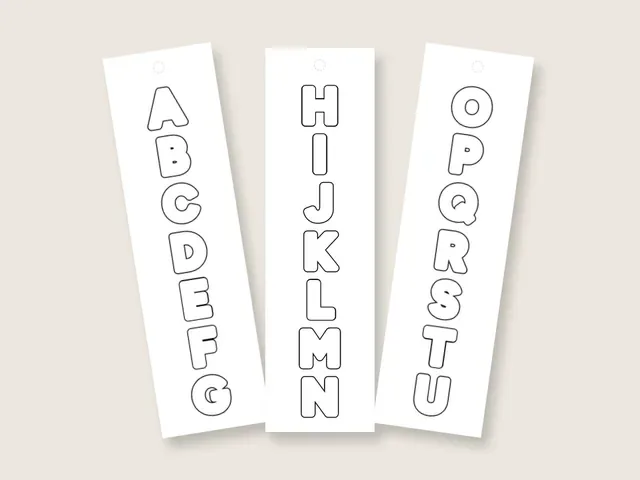
Our bubble letter alphabet has one letter per page, about 7 inches across, plus A to Z on four bookmarks, all free to print and color. For a child who wants to draw their own letters, those pages are the wrong thing. Give them the penny and the pencil instead.
A practice plan that builds the skill
Ten minutes a day for a week builds the hand faster than one long afternoon, because the outline motion has to become automatic before you can think about spacing. Take one group a day and draw each letter three times at one inch tall.
- Day 1 is O, I, L and T, the straight and round letters
- Day 2 is C, U, J and S, the curves
- Day 3 is E, F and H, the arms and their gaps
- Day 4 is A, B, D, P and R, the holes
- Day 5 is M, N, W, V and K, the inside points
- Day 6 is a four-letter word
- Day 7 is your name, inked and colored
The second week, repeat the plan at half an inch tall, where the holes start to close, then at two inches, where uneven fatness shows. Keep every sheet in a folder, dated, so the day-one O sits next to the O from two weeks later.
Sources
- Wikipedia, Lettering (n.d.) (last checked 2026-10-13)
- Wikipedia, Graffiti (n.d.) (last checked 2026-10-13)
- Wikipedia, Phase 2 (artist) (n.d.) (last checked 2026-10-13)
- Aneurin Bevan University Health Board (NHS Wales), Occupational Therapy Service for Children and Young People, Development of a Tripod Pencil Grip (2024) (last checked 2026-10-13)
- Cumbria Partnership NHS Foundation Trust, Handwriting and the development of writing (2017) (last checked 2026-10-13)